CS AC Director Expectations
PwC Director Performance & Development Platform
#UI Design
#UX Enhancement
#User Story
#Illustrations
Gen 2
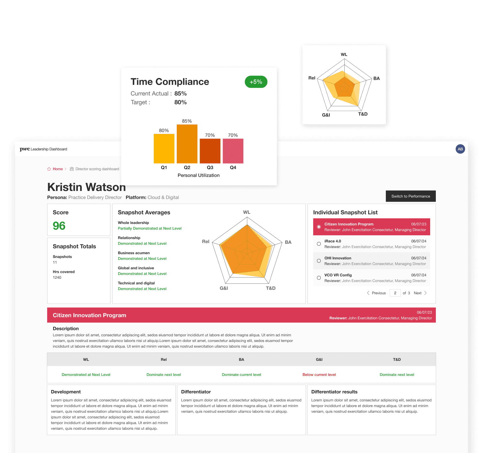
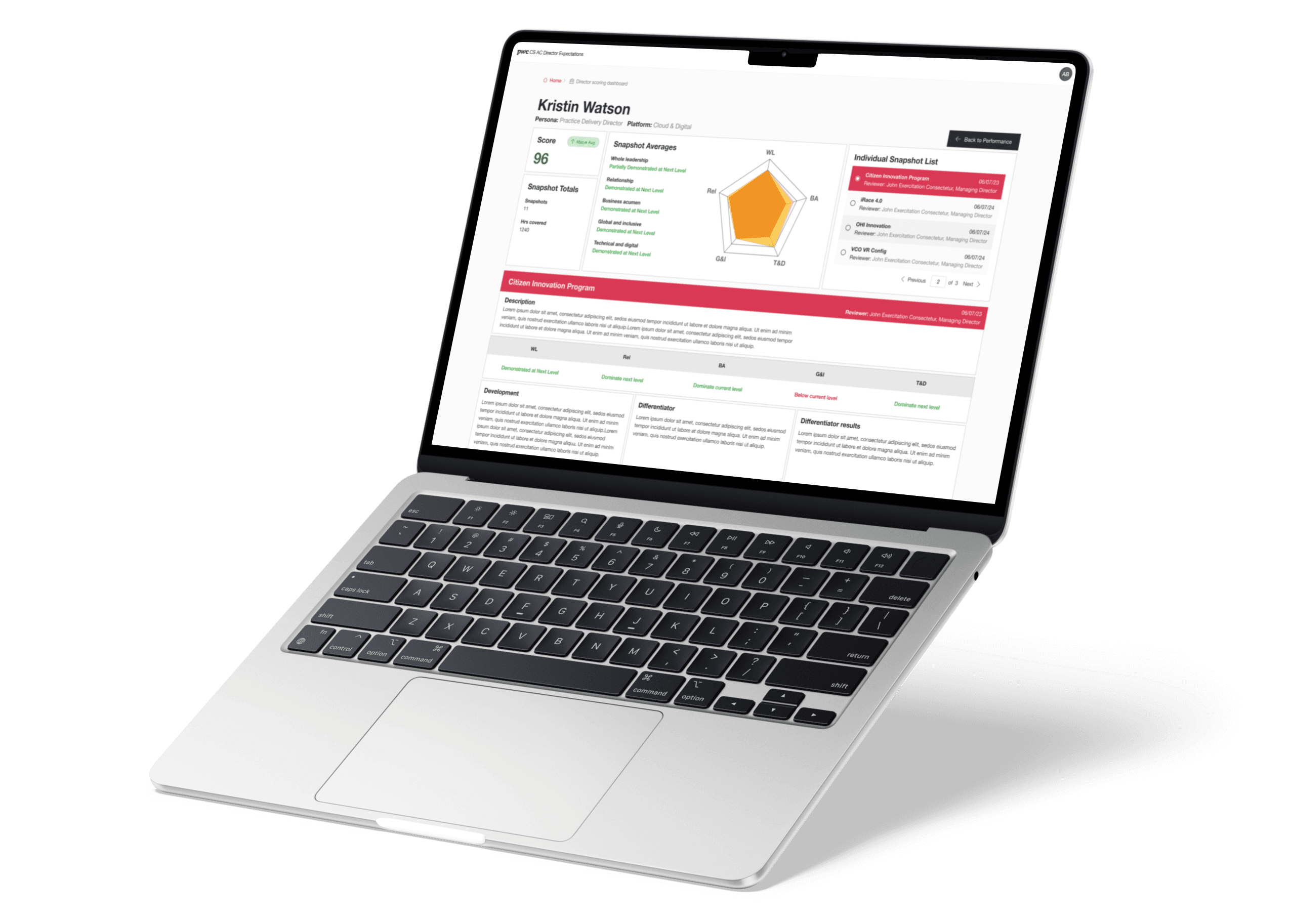
The Gen2 user interface is proposing a streamlined workflow and a modern layout.
200+
Led PwC Partner & Sr. Director performance platform launch, impacting 200+ leaders.
Oeverview
This tool is designed for Managing Directors and Partners, it helps oversee and evaluate directors' performance worldwide. It assists in goal setting and keeps everyone on track.
I joined this project in the final stages for 4-5 weeks, taking over from the previous designer to improve the original UI/UX. I've worked with the product owner and stakeholders on another project and we had a great working experience. So they got in touch with my leader to bring me on board for this one.
Understand the user needs and goals
We had a few meetings to understand what are their pain points and expectations, and what are the objectives and outcomes they want to achieve with the platform.
These people have very demanding schedules and need a streamlined interface with reduced clicks. And simplify the flow, allowing them to quickly access content.
Collaborative Problem-Solving:
Joint review of user stories and project documents: Review existing documentation together with the PO to gain insights into the initial design goals and user needs, and discuss their concerns about the previous design and the desired improvements.
Focus on specific pain points: Encourage the PO to share specific instances or examples where the previous design created difficulties for users.
Conduct a critical task analysis to identify the most crucial tasks directors perform within the platform.
Prioritize the most critical user flows and functionalities for focused user testing.
Define the key performance indicators
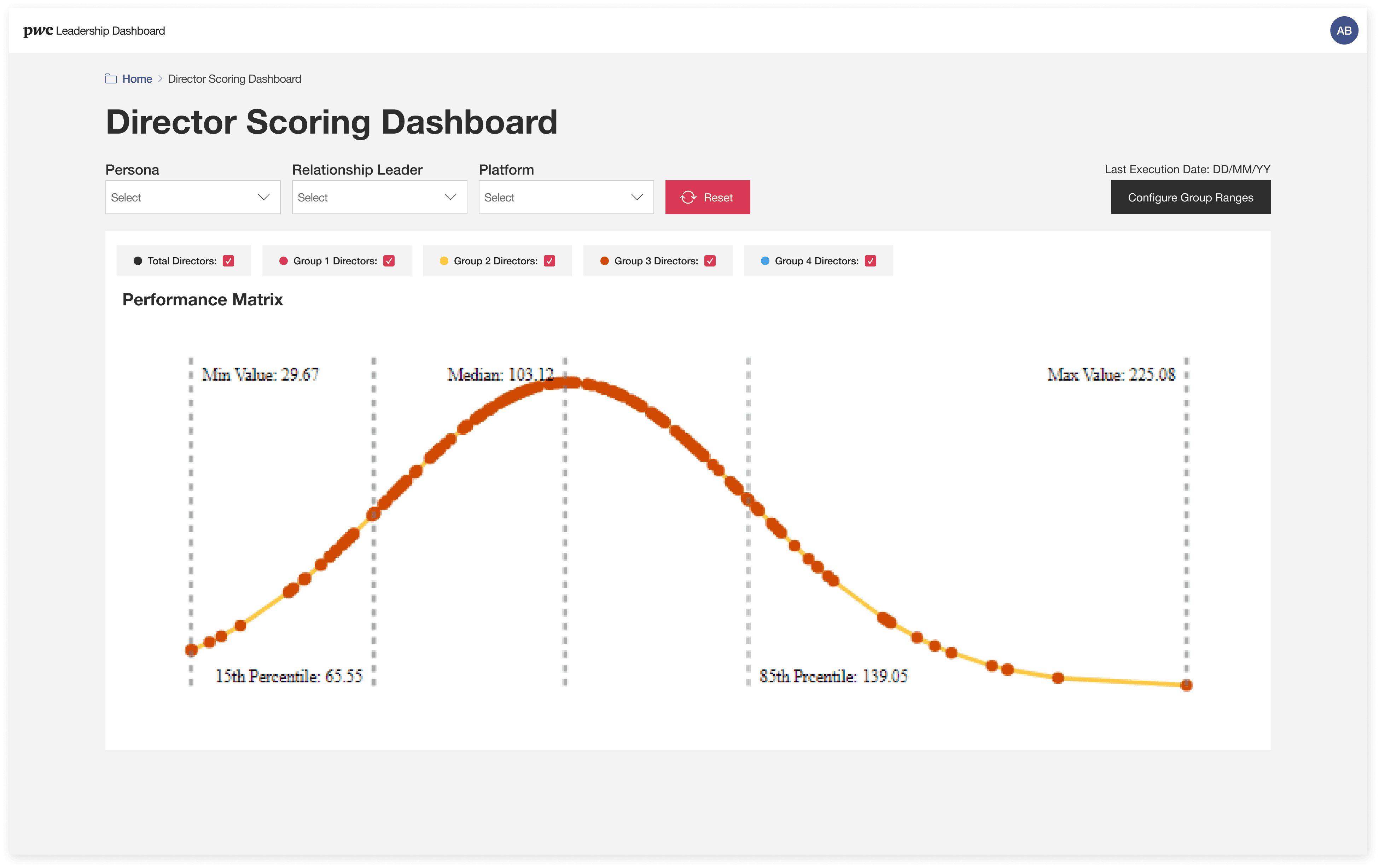
Identify the most relevant and measurable indicators that reflect the director’s performance, such as time compliance, snapshots, Sales credit, etc.
New Design
Original
Design the performance dashboard
Create a visual representation of the KPIs and their progress which is easy to navigate and understand, even for non-technical users.
1
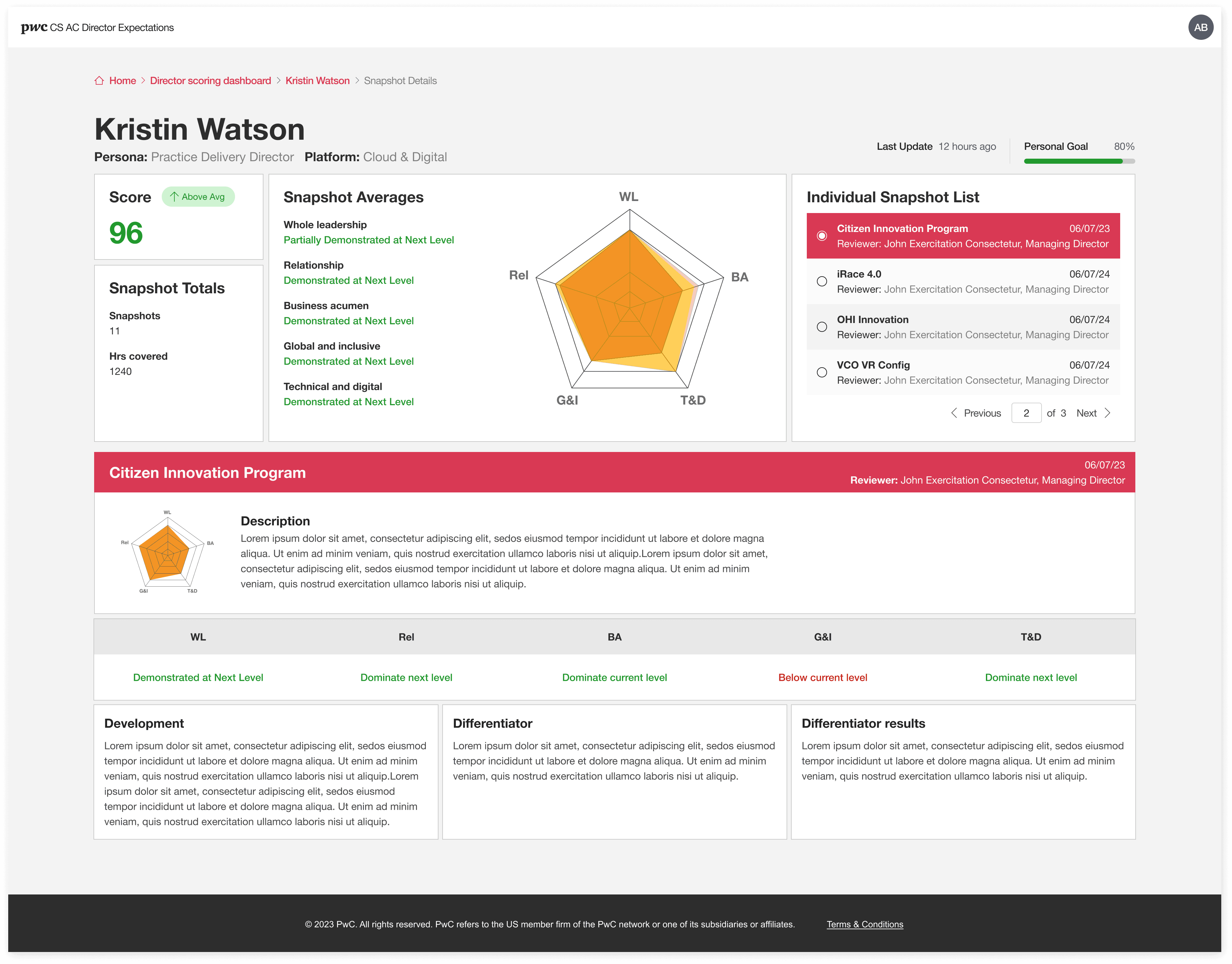
Improve Information Hierarchy:
Implement a clear visual hierarchy to prioritize and present essential information
Problem in original UI: Unclear Information and Details. The original design lacks clarity, making it difficult to quickly understand key performance information and access additional details.
2
Add tabbed sections:
Organize additional details and advanced metrics into clear tabbed sections. Users can then choose to explore specific areas of interest without overwhelming the initial view.
Problem in original UI: Excessive Scrolling. Normally each person will have at least 12+ snapshots each year, the original design requires excessive scrolling, hindering quick access to crucial information and creating frustration for users.
3
Adjust visual hierarchy:
As mentioned earlier, utilize visual hierarchy to guide users' attention towards the most crucial information.
Problem in original UI: Incorrect focusing area on the page. The original design draws attention to irrelevant or less important information, distracting users from the key performance insights.

New Design
Original
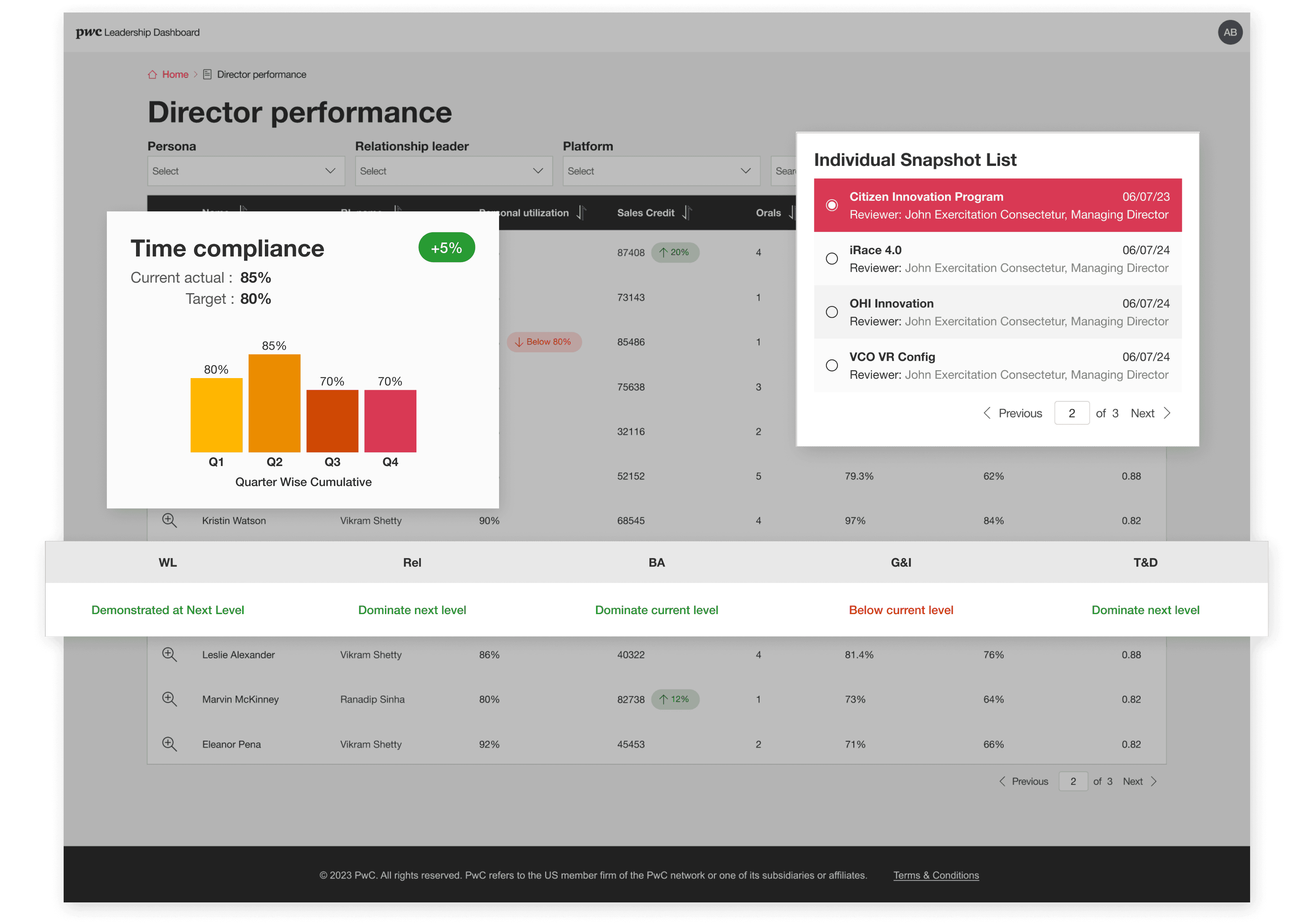
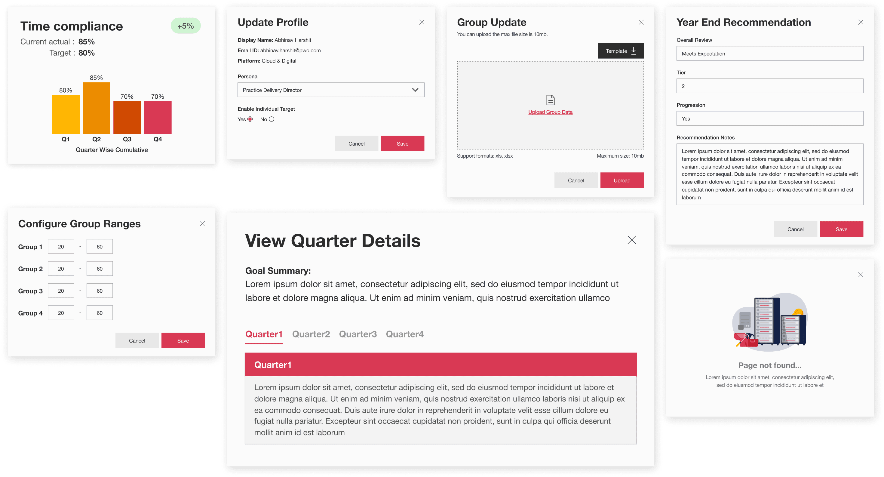
Redesigned the pop-up and charts to keep the consistence
Problem in original UI: The previous pop-up design lacked consistency in appearance and prioritization of information, potentially confusing and frustrating users.
Define Consistent Style Guide: ensures a smooth visual experience across all pop-ups and maintains brand recognition.
Prioritization with Visual Hierarchy: Implement a clear visual hierarchy within each pop-up to guide users' attention towards the most crucial information.
Focus on essential information: Ensure pop-up content is neat and delivers the necessary information without overwhelming users.
New Design
Original
Goal:
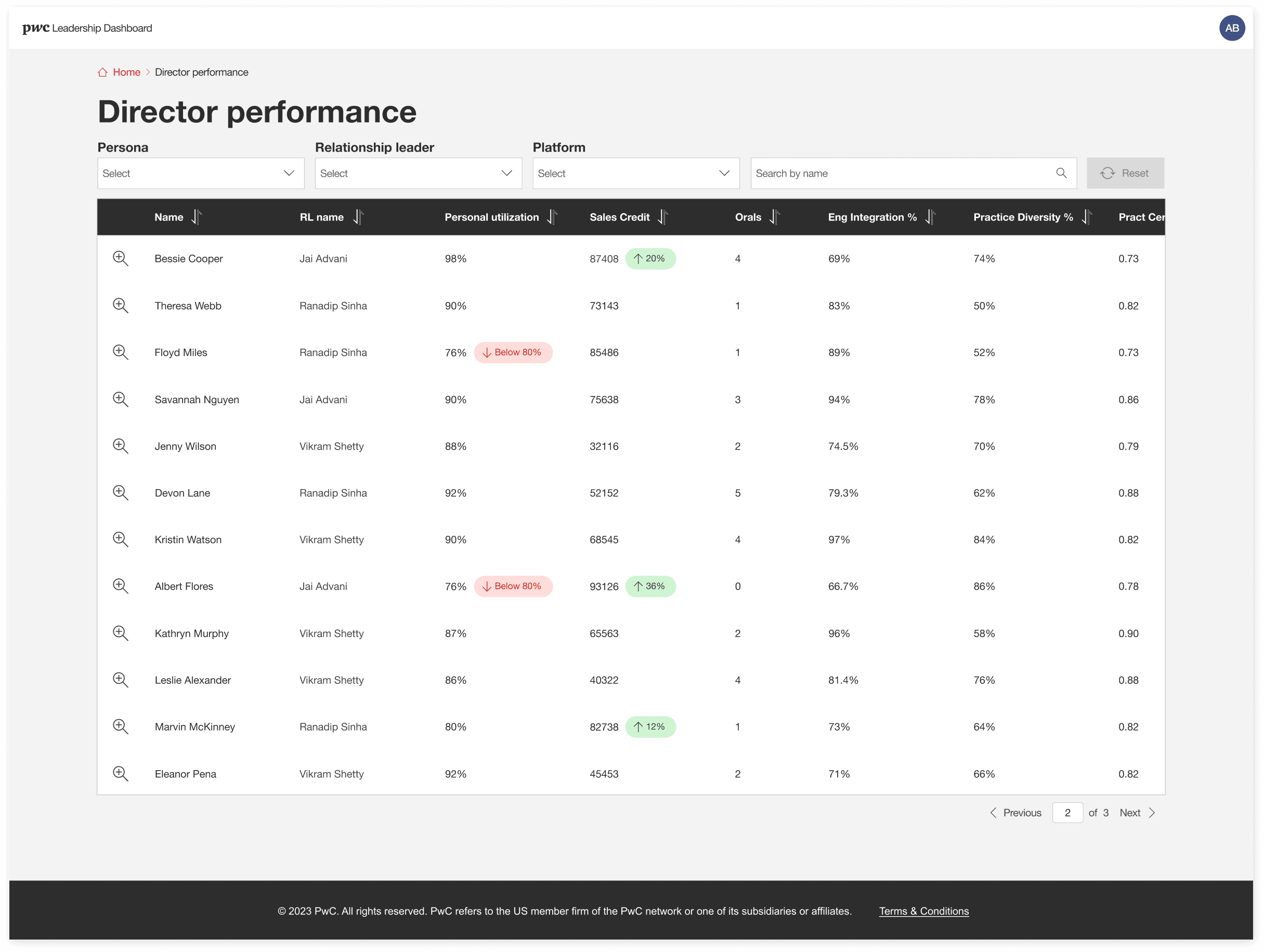
Create a simple and efficient table view that allows partners to quickly review performance information for all directors.
1
Prioritize Essential Columns:
Conduct a stakeholder workshop or user testing to identify the 3-5 most critical performance metrics partners need to review at a glance.
2
Visual Hierarchy for Scannability:
Employ a clear visual hierarchy to differentiate essential information within each column.
3
Actionable Insights:
Implement a clickable icon in the first column, allowing for quick access to detailed performance information.
4
Pagination and Less Scrolling:
Implementing pagination if the number of directors exceeds a comfortable viewing limit on a single page.
New Design
Original
Create a simple and efficient table view that allows partners to quickly review performance information for all directors.
1
Prioritize Essential Columns:
Conduct a stakeholder workshop or user testing to identify the 3-5 most critical performance metrics partners need to review at a glance.
2
Visual Hierarchy for Scannability:
Employ a clear visual hierarchy to differentiate essential information within each column.
3
Actionable Insights:
Implement a clickable icon in the first column, allowing for quick access to detailed performance information.
4
Pagination and Less Scrolling:
Implementing pagination if the number of directors exceeds a comfortable viewing limit on a single page.
New Design
Original
Goal:
Create a simple and efficient table view that allows partners to quickly review performance information for all directors.
1
Prioritize Essential Columns:
Conduct a stakeholder workshop or user testing to identify the 3-5 most critical performance metrics partners need to review at a glance.
2
Visual Hierarchy for Scannability:
Employ a clear visual hierarchy to differentiate essential information within each column.
3
Actionable Insights:
Implement a clickable icon in the first column, allowing for quick access to detailed performance information.
4
Pagination and Less Scrolling:
Implementing pagination if the number of directors exceeds a comfortable viewing limit on a single page.
